

navigatEDU:
An interactive learning platform teaching digital literacy skills

My Role: UX Designer, Researcher
Timeline: 5 days
Format: Desktop Website
Year: 2023
Background:
I created this project for the General Assembly May 2023 Hackathon. I worked on a cross-functional team with 4 other UX designers, and 4 developers.
Our goal was to build a product from scratch, based on the theme “Digital Equity and Accessibility.”

Under 5 Days
Due to the time crunch, our research capabilities were extremely limited.
In under 5 days, we needed to conduct all of our research, synthesize the data, design a prototype, and still give our developers enough time to build everything for presentation day.
Finding a direction
During our initial research, we came across a 2018 survey indicating that some students and families in the US still lack adequate access to devices, hardware, or broadband internet.

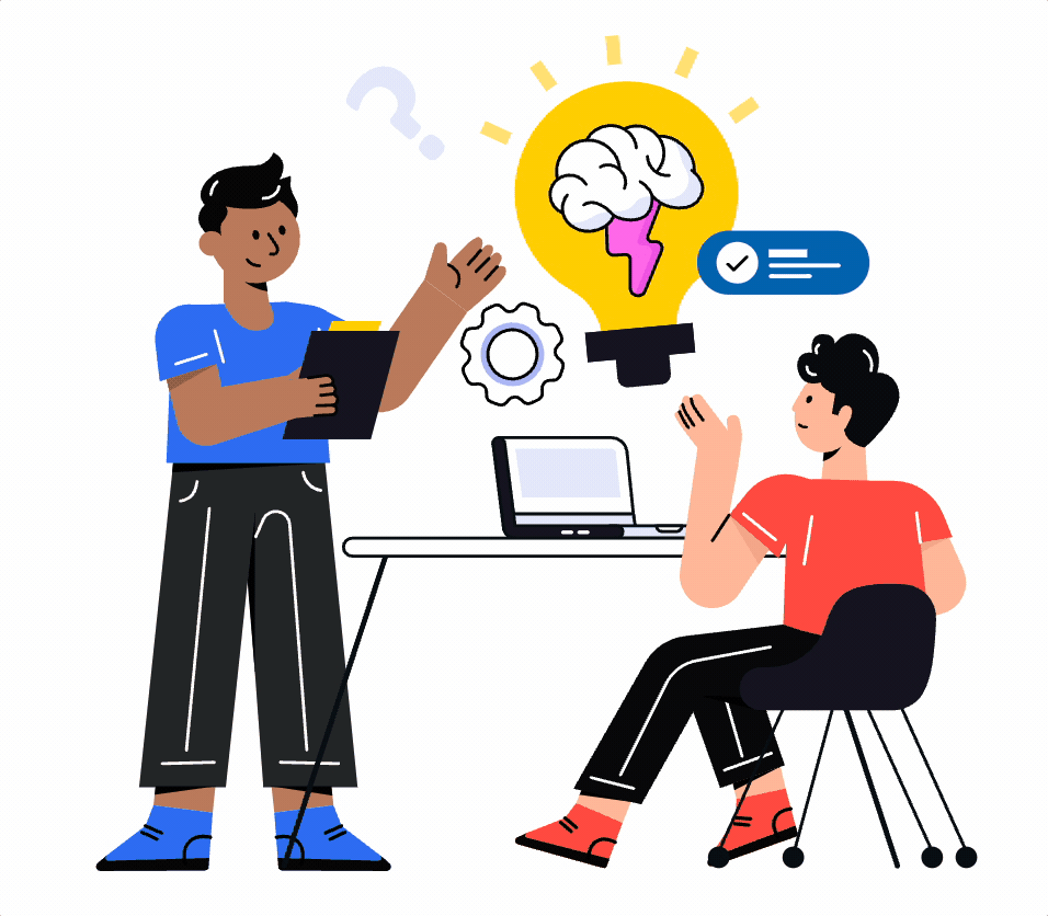
With this finding, we reached out to education professionals to interview them further on this topic.
User Research

We spoke to 4 educational professionals from school districts across the US, spanning states of Hawaii, Texas, Chicago, and New York.
We asked each of them about their district’s technological needs, but we came across an unexpected discovery:

“Right now we do not have a need for devices…. we are more than 1 : 1 at our school.”
- Daniel, asst. principal, Chicago Public School
“The COVID pandemic forced our district... into a 1 : 1 device setting.”
- Tina, administrator from Pine Bush, NY
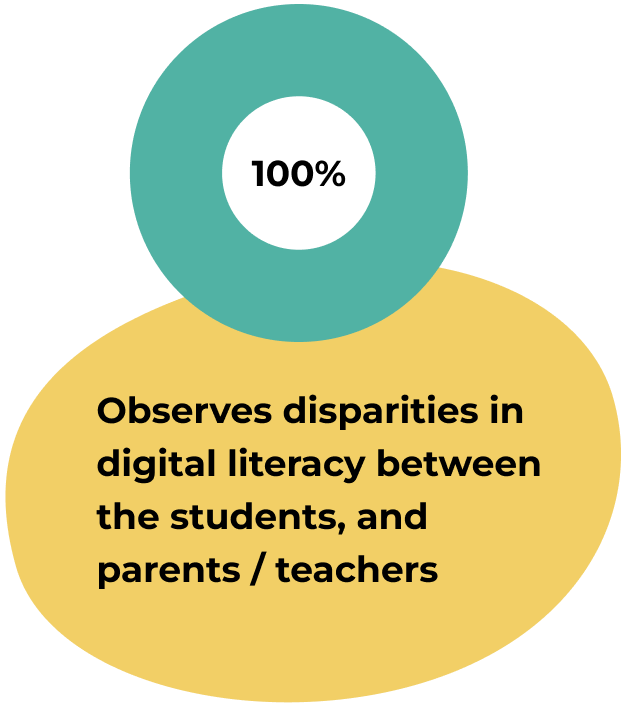
All four interviewees mentioned a gap in digital literacy between students, and their parents or teachers.

With diverse student populations, our interviewees also expressed empathy for non-English speaking parents who struggle with digital literacy.
The Pivot
With our interview findings, we found ourselves at a crossroads. The effects of COVID had changed the educational landscape, and now educators faced a different set of issues, so….

We decided to pivot.
Understandably, some members of our group had concerns about changing course.
But, after some tactful discussion, our team agreed:

Defining the Problem
From here we defined our problem statement:
Families across the US experience issues with educational systems, because they require digital literacy to interact with school districts.

So we asked ourselves:
How Might We….
…create a digital literacy platform that provides interactive learning?
…build a platform adaptable to language barriers?
….empower families and educators to bridge the digital divide?
Market Research
To help us solve these problems, we conducted market research to see what existing products are doing to bridge the digital literacy gap, and we found 3 websites:
DigitalLearn.org, GCF Global, and TechBoomers.
Among these competitors, we saw 4 common features they all shared:


My favorite of these features was the language translation, because it would most directly address the topic of equity & accessibility, as it related to our problems.
At first we weren’t sure if this could make it into our MVP, but everyone on our team agreed it would be a valuable asset for our product, if we could pull it off in time.
Free Language Translation API
Shortly after we met with our developers, I was thrilled to hear that our team found a free translation API, which we could use to offer a wide variety of different languages!

Building the Framework
Our developers also found some open-source, pre-built code to use for the front-end:
An interactive, mock web browser
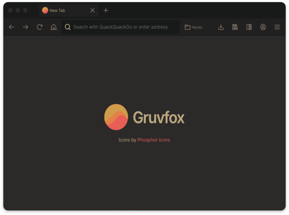
We agreed to proceed with this as a main feature for our MVP, since it would provide a familiar interface, with a thematic relationship to our problems.
This would also allow the developers to begin building while the UX team continued with its next phases of research and design.
Meanwhile, we created a user flow with the aim to make navigation as simple as possible.
Our main feature would be lessons displayed as an interactive slideshow. Most of the time would be spent on a single page, where the user would click through the browser interface to view each of the slides.

With our main features decided, we began building our wireframes and quickly iterating on them. Our goal was create a balanced & visually appealing composition, with a clear hierarchy of information.


Branding
As we began building our framework, we also created a simplified brand identity around the concepts of learning and imperfect growth.
We wanted to create a sense of fun and comfort as we leaned into colors often tied to school settings.
Using organic shapes and tinted jewel tones, we wanted NavigateEDU to have a friendly, approachable feel.

Final Result
Although the product was still a bit rough around the edges, our team was proud to get a working site published in time for presentation day.

Click the image below to check out the website! *
*Note: Due to time constraints, we could only create a desktop version of the site, but ideally we’d like to have made it responsive for mobile as well.
Next Steps
Given more time, these would have been our next steps:

This was our #1 next step. Usability testing was one of our top priorities for UX research, but time constraints caused us to continually push it down the list until it was too late.
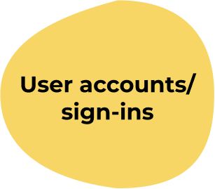
We understood that a learning platform like this would require a secure login and account creation, so that users could pick up their lessons where they left off.

We assumed that a platform teaching digital literacy would probably need live customer support to assist users. More research would be required as to how to best achieve this.

Being free-to-use was a key part of keeping our product accessible, but we needed more research to see how this endeavor could be financially viable.
Lessons & Takeaways
Throughout the hackathon experience I gained valuable experience cross-collaborating with developers as well as other designers.

I also strengthened my management experience by keeping our team together when the stress reached a breaking point for some of our teammates.
On the presentation day, I was our group’s main presenter. I put my sales experience (and fine art education) to work, selling our solution to the judges.

The judges encouraged me to continue utilizing my talent in strong communication, and stated that I would be a valuable asset when presenting solutions to stakeholders.
That concludes this case study. Thank you!
To find out more, contact me for an interview!