
Infinite Goods
Ecommerce redesign strategy for a sustainable fashion retailer

My Role: Project manager, Client relationship manager, User research lead, UI designer
Timeline: 3 weeks
Platform: Responsive ecommerce website
Year: 2023

Background
The CEO values transparency in the messaging around sustainable practices.
They developed a system to grade the sustainability of each product they carry.
Grades are displayed using a unique eco-label, aka the Sustainability Score card.
Business Goals
When our team first met with the CEO, these were her 3 objectives:

Decrease current bounce rates (40%) by redesigning the home page

Increase time spent on the website (1m 14s) with expanded storytelling

Increase conversion rates (2%) with more seamless navigation
User Research
We started by conducting user interviews and usability tests with 9 people to help us identify the major main points users were experiencing with the existing site.
We found that 66% of users had difficulty trying to interpret the sustainability information.
On product pages, the common complaints we heard were about the Sustainability Score Card:

"The specific info is nice to have, but it's not presented in the best way."
and…
"How is this product scored ‘A’ when certain criteria is unknown or scored low?"
When those people went to the Methodology page to find out how the scores were created, they expressed even more confusion about how that information was displayed:

"The timeline format and percentages are confusing… what do those even mean?"
and…
"How are these percentages weighted? Why does it jump from 0%, to 40%, and then to 60%, etc?"
Plus, nearly all of the people missed that this was actually a carousel of different criteria. The only clue was a small navigation beneath the image, so most users didn’t notice that there were more slides to click through.
We also encountered this dichotomy during our user research:

100%
"I want to see specifics about how they are sustainable/ ethical"
On one hand, everyone stated that they wanted to see information about what makes the clothing sustainable. They were suspicious of companies “green-washing” to appear more sustainable than they really are.
BUT
100%
“I don't want to read through a bunch of stuff while I'm trying to shop”

But, everyone ALSO said that they didn't want to spent time reading about all the research while they are trying to shop. The typical Infinite Goods customer was a busy, metropolitan person with limited time on their hands.
So how do we know how much info is just enough?
This question became one of our team’s biggest challenges to overcome.
But even with that challenge, we now had a set of clear goals for our redesign:

The users need digestible information, and they need to build trust in the business (esp. around sustainability).
Both users and the business need improvements to the navigation.
The business needed to increase time spent on the homepage, along with expanded storytelling.
We were also able to establish a baseline usability score for the existing site.
Our participants filled out a standardized System Usability Survey to quantify the overall usability of the existing site.

With an overall SUS score of 70.17 (considered average), we aimed to achieve a score of 80 or higher in our next round of usability tests with the proposed redesign.
Market Research
Our team analyzed 4 competitors to find out what others in the sustainable fashion industry were doing to meet some of these user & business needs.
We created a content audit of the 4 competitors to analyze the narrative structure of their landing pages, to see how we can expand Infinite Goods’s storytelling.
Our findings revealed a strategic storytelling approach that the competitors had in common. For example:
The top of the home page has the 1st header focused on e-commerce, with a CTA encouraging users to start shopping.
Scrolling down a bit, the 2nd headers usually highlight the problem with fast fashion, thereby providing a value proposition for shopping sustainably.
Further down the page, the 3rd headers typically showcase the company's environmental initiatives or partnerships, further strengthening the messaging around sustainability.
We also discovered all of the competitors have a separate page to highlight their environmental partners & initiatives:

Toad & Company

Everlane
Whereas, our client’s website did not have any info about partnerships or initiatives.
So this became another idea that we wanted to incorporate in our redesign, to help us meet the user’s need of building trust & credibility in the business.
Additionally, when it came to product pages, we found 3 out the 4 competitors used icons to visualize how a purchase was making a positive, sustainable impact.
This gave us the idea to incorporate icons to make the sustainability info more digestible for users.
Sketches & Mid-Fi Iterations
From there, everyone on our team sketched some rough layouts, and then we combined our ideas into some mid-fidelity wireframes.
We split up the workload so each teammate was responsible for certain parts of the website.


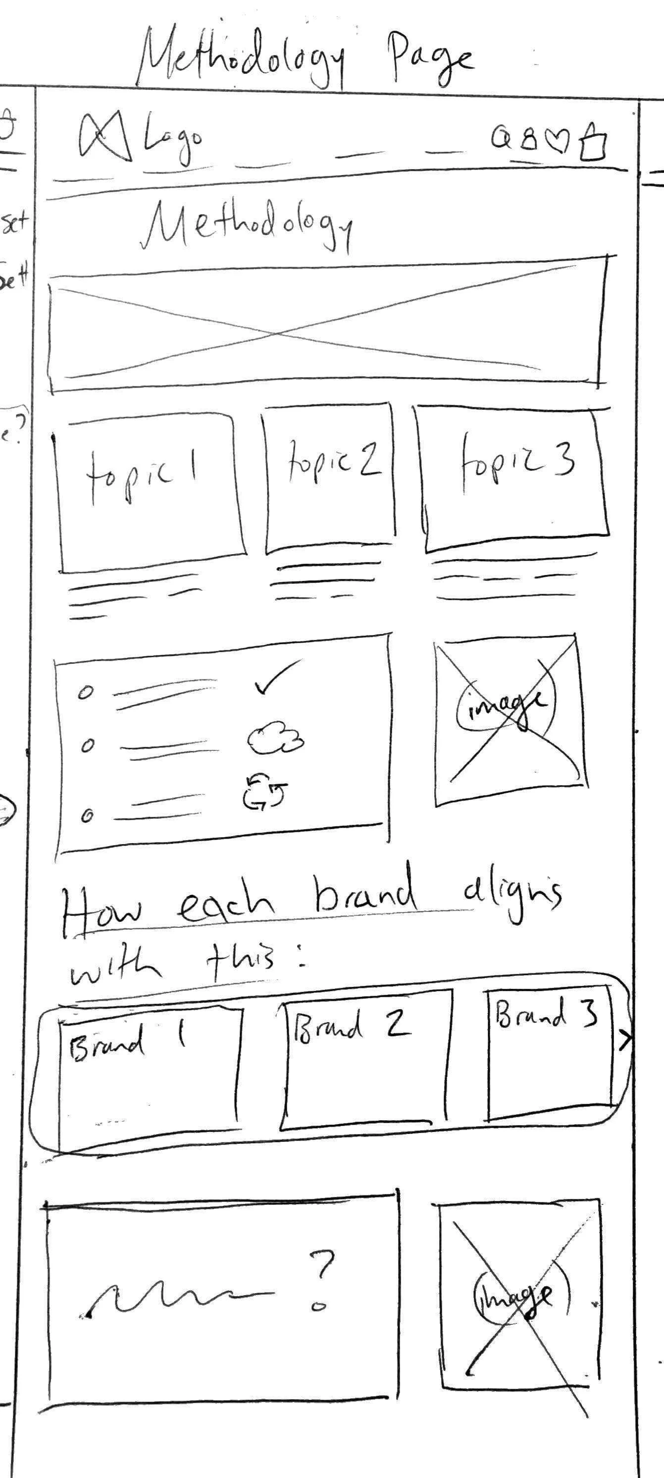
I took on the Methodology Page, where my aim was to move away from the existing sustainability grading scale, since it confused many users.
I designed a set of icons to represent each of their 12 sustainability criteria.

I also hoped to improve navigation with a linear scroll format, because many users were confused by the carousels, or missed them entirely.
In order to keep the scroll from being too long, I implemented a toggle to switch between the two categories: Planet metrics, and People metrics.
One of my teammates vamped up the home page to feature more products, more storytelling elements, & more visuals as an effort to increase time spent.
For the product page, another of my teammates used the new icons to highlight how each product is sustainable, in place of the score card that users struggled to understand.
Each product page would display the new icons for whichever criteria the product meets, and customers could click the icons to pull up more information if they wish.
We hoped this would make the sustainability messaging more digestible, while keeping it accessible and unobtrusive.
From there, we conducted usability tests with 6 more people with our Mid-Fidelity wireflows.

Overall, the average System Usability Score jumped up to 90- an increase of almost 20 points!
We thought- great! Nice improvement!
We were excited to show those results to our client, but things did not go as expected during our meeting with the CEO….
Meeting with the CEO
During our next meeting with the CEO, we showed her our mid-fidelity wireframes, and we also showed her a High-Fidelity screen of the home page.
The CEO told us that she was impressed with our insights, and loved the new homepage. HOWEVER, she did NOT like the new system using icons, despite the 20-point increase in the System Usability Score.

Our client stated that her current system using the grading scale was one of her company's main value propositions. So after hearing that, we knew our client was not willing to move away from the grading scale.
So Now What??
A large part of our proposal hinged on switching to icons, but we wanted to deliver something that the CEO was happy with as well.
At this point we asked ourselves:
Do we keep going with what we created, and try to convince the CEO that its for the best?
Or do we go back and figure out a way to utilize the existing sustainability grading scale system?
To figure out which direction to go, we did some more testing.

The Pivot
At this point we were already low on time, but we needed to obtain more data to decide between the icons vs. grading scale.
I created hi-fidelity versions of the Methodology page for both options, and scrambled to find 6 more people that could do a quick A/B test ASAP.
I tested each version with 3 people- Version A used the existing sustainability grading scales (with the page reformatted to a linear scroll instead of carousels), and we tested it against Version B, which used the newly developed icons in a similar linear scroll layout.
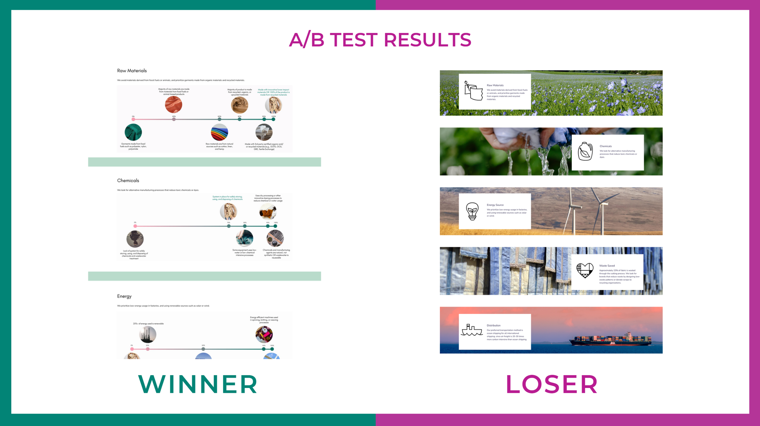
From those A/B tests, we found that the existing grading scales tested better than the new system we developed using icons!
Despite the initial user feedback indicating that the info isn’t very digestible, more users still preferred the grading scale over the icons.
Lessons Learned:

We knew a lot of research went into developing their existing methodology, so perhaps it was too soon to completely disregard the grading scale.
The sustainability grades demonstrated transparency, but our icons lacked that level of transparency.

We realized that a total overhaul of the sustainability information was an OVER-correction of the problem.
Our users didn't need an entirely different system to make the information more digestible- they just needed targeted changes to the existing one (next steps).
High Fidelity Designs
By this point we were out of time to conduct more targeted research, but there were still some changes we could make to improve overall navigation, so we continued with our Hi-Fidelity mockups.
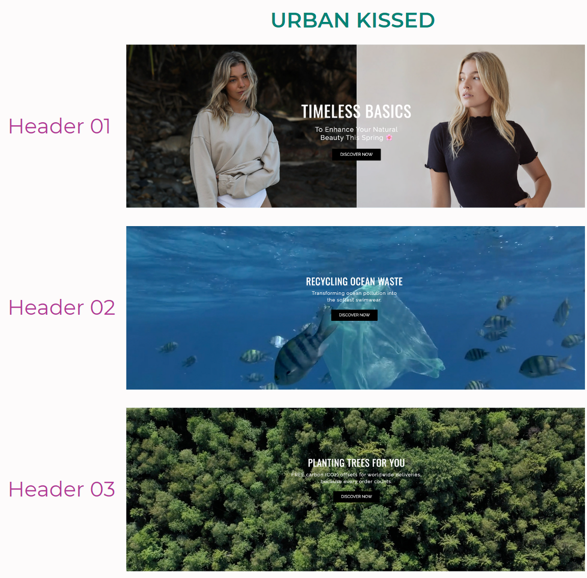
On the homepage we added high quality visuals, highlighted product collections, and we added more storytelling elements. We also included a section addressing the problem occurring now in the fashion industry, and how Infinite Goods is working to change that:
Taking into account our client’s business goals, and our latest A/B test results around the sustainability info, we reverted to the original sustainability grading scale on the product pages.
We also wanted to address the needs of the user, so we condensed the information into a drop down pop-up, so that users can access who the info behind the sustainability score by toggling between People and Planet metrics:
Once we got rid of the eco-icons, we reorganized the Methodology page in a linear fashion to make the information more scannable for the user, as opposed to hiding it behind the ambiguous carousels.
Similarly to the scoring on the product page, we added two tabs for Planet and People metrics that users can toggle between to learn more about how their purchase was making a positive impact, and keep the formatting consistent across the website:
Lastly, we asked the CEO of Infinite Goods for a list of their current sustainability goals, as well as their environmental partners & initiatives so we could feature them all on a new Mission page, allowing them to strengthen the consumer-business relationship:
Final Results
At the time of writing this (~1 month later), they have already begun implementing several elements from our proposal into the Infinite Goods site.
When we presented our final proposal to the CEO, she told us she was thrilled with the final result. Unfortunately my team no longer has access to the Google analytics dashboard, but we’re hoping to hear about any changes to their metrics in the near future.
She also expressed joy that we listened to her concerns, and that we took time to validate our design decisions around the sustainability messaging.
The CEO also left this review on my LinkedIn page afterwards:
Next Steps
If our team had remained on this project, these would have been the next steps we’d recommend taking to continue improving the Infinite Goods ecommerce experience.
Reconnect with the CEO to better understand how the letter grades were weighted on the sustainability scale, since that's not stated on their website currently
Conduct more research to discover how we can apply targeted changes to the sustainability grading system so that its more digestible and understandable
Ensure visuals and interactive elements are cohesive across all pages by expanding redesign to other key pages
That’s all for now!
Thanks for taking the time to check out my case study!